- Topics
- Feature
- Opportunities & Events
- Data
- Hindi Portal
- Topics
- Feature
- Opportunities & Events
- Data
- Hindi Portal

Women patiently wait for the sun to go down, to squat in open fields. Young children do so unabashedly on the roads under the open skies. Well into our 67th year of independence, the sanitation situation hasn't changed much in villages and towns across the nation. However, the Nirmal Bharat Abhiyan has set out to do just that.
It is a government programme to tackle open defecation in rural India. It went from being called the 'Central Rural Sanitation Programme (1986)' to the 'Total Sanitation Campaign (1999)' and is today re-packaged as the 'Nirmal Bharat Abhiyan, NBA, (2012)'. It aims to accelerate and ensure sanitation coverage in rural India. The programme not only provides subsidies but also raises awareness about sanitation as a whole.
The NBA was allotted Rs. 3500 crores in the 2012-13 budget and around 27 lakh toilets were constructed just in the last year. The data generated by this scheme is immense:
Reams of papers record this information, and hundreds of spreadsheets document the performance and progress of the rural sanitation scheme across the country but these mind boggling numbers are a tough read. So how can the average person make some sense of this data
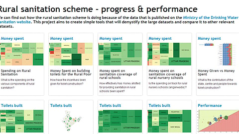
A project by Arghyam does just this. It uses simple tools to visualize cumbersome data. The 'Spending on rural sanitation' visualisation shows that even though the largest amount planned for rural sanitation was for Uttar Pradesh, it ended up spending much more than the allotted money.
Goa (top corner in red) has under utilized the money alloted to it for sanitation coverage in rural schools. Do the schools there already have enough toilets, and hence the lesser spending or were the subsidies simply not touched?
Sikkim and Nagaland, spend more money and constructed lesser toilets while in Dadra and Nagar Haveli, the central government contributed the full 100% for the sanitation scheme, without the rural population adding anything to the financial aid.
Which of the states lead the way in building 'loos' and which ones didn't keep up with the programme? Which district went its own way and did not conform to the general plan of the state? The visualisation below helps explain all of this.
The colours and sizes that depict each state in this visualization tool help understand the 'toilet' scenario across the nation. The size of the circle denotes the total number of rural households as per the 2011 census, while the colour of the circle shows the number of rural households that have toilets.
These easy visualisation tools throw up a medley of questions and paint an interesting picture of the sanitation status of different states. Here, each quirk and anamoly is open to interpretation and tells its own story.
Majority of people practicing open defecation in the world are from India. This has very serious implications on health especially the health of children. We believe that the discussion needs to move beyond toilet construction and should start focusing on usage. A look at the larger picture of open defecation:
Open defecation in rural india remains a problem that perplexes policy makers. The first government level initiative to tackle it came in the form of the Central Rural Sanitation Programme in 1986. A subsidy-driven approach was adopted.
This programme morphed to take into account the necessity to educate and empower people to adopt and use toilets - the Total Sanitation Campaign in 1999 - and to adopt a panchayat-based approach rather than a household-based one - the Nirmal Bharat Abhiyan in 2012. The scheme was allotted Rs. 3500 crores in 2012-13 budget (before revision) and around 27 lakh toilets were constructed last year.
This was also a large scale attempt to decentralise data collection as districts enter data into the Integrated Management Information System (IMIS) on the government website directly. What has resulted is a vast collection of cumulative data from 2001 on the status of sanitation, available up to the habitation level.
The State of Sanitation focuses on looking at government spends on sanitation - from both the qualitative aspects of data that is present on the website and also the implementation of the government's scheme. The aim is to understand the sanitation data better & help make the data that is available be more accessible to a larger audience.
The data is presented in the IMIS in multiple tables in often-repeated formats, which are difficult for a lay person to understand. Also the data is presented using terms that are not familiar so it is difficult to understand what the data is trying to convey. They don’t allow for analysis across certain parameters.
For instance, physical progress and financials are never compared so you can’t see if what they are spending makes sense compared to the number of toilets that are being reported.
The idea with working on it was to help create simple colour and size-based tools that would make the numbers easier to understand for anyone who wants to use them. At a glance you can see the entire country's picture and then zoom down to the states. This unpacks the numbers and presents them in a meaningful way.
Citizens can track the progress of the scheme in areas they are interested in. This will help them understand sanitation coverage and interact with the data more.
Data has to be taken from the IMIS and fed into the visual to get a clear picture of the state of sanitation. A few interesting insights:
It shows that they are actually building toilets but it is not reflecting in the IMIS - this may be because of poor data entry or because their funding for toilet construction comes from elsewhere.
It indicates over-reporting and distortion of coverage figures across the country.
The idea is to take this work to the Ministry of Drinking Water and Sanitation and make them build a citizen-facing portal. This will help take the data to a wider audience. It will be a portal that shares data/ information which is easy to understand, access and make sense of, like we have done here.